

There are five types of positions in CSS namely static, relative, absolute, fixed and sticky.
Before understanding position let us first understand what is z-index because z-index is applicable to position.
z-index
z-index is the order (stack order) by which one element is placed on top or below the other element. The default value of z-index is zero. Whether we give the value of the z-index as zero or we do not write anything related to the z-index, the element will take the value of the z-index as zero.
The higher the value of the z-index, the more on top the element will be placed. Similarly, the lower the value of the z-index, the more below the element will be placed.
z-index can take a negative value, zero or positive value. Since the z-index represents an order (stack order), therefore there is no unit of z-index. It is known as z-index because we see elements on the screen along the imaginary z-axis which penetrates the screen of our laptop.
For example, let us understand what is z-index using absolute position (absolute position is explained in the 3rd point of this article, so only focus on the z-index part in the CSS code):
HTML code:
    <div class="container">
        <div class="one">1</div>
        <div class="two">2</div>
        <div class="three">3</div>
        <div class="four">4</div>
    </div>
CSS code:
body{
    background-color: grey;
}

.container{
    background-color: blue;
    position: relative;
    height: 500px;
    z-index: -4;
    width: 50%;
    margin: 5% auto;
}

.one{
    background-color: aqua;
    position: absolute;
    height: 50px;
    width: 50px;
    font-size: xx-large;
    text-align: center;
    z-index: 0;
}

.two{
    background-color: greenyellow;
    position: absolute;
    height: 100px;
    width: 100px;
    text-align: center;
    font-size: 60px;
    z-index: -1;
}

.three{
    background-color: pink;
    position: absolute;
    height: 200px;
    width: 200px;
    text-align: center;
    font-size: 150px;
    z-index: -2;
}

.four{
    background-color: yellow;
    position: absolute;
    height: 350px;
    width: 350px;
    text-align: center;
    font-size: 350px;
    z-index: -3;
}
Output:

In the above example, the z-index of class one is zero (lesser as compared to the z-index of other elements i.e. class two, three, four and container) so it is at the topmost. z-index of class two is -1 so it is just below class one. z-index of class three is -2 so it is just below class two. z-index of class four is -3 so it is just below class three. z-index of class container is -4 so it is just below class four.
1. Static position
This is the default position of an element on the web page. There is no need to mention the position as static while writing the CSS for the element. Even while writing CSS for the element, if the position is mentioned as static then there will be no effect. The element whose position is static is positioned according to the normal flow of the document i.e. the order in which different elements are arranged on the web page (the order in which text, buttons, images, videos, etc.) is maintained (remains as it is).
An element is not even considered a positioned element if its position is static because the static position is the default position of an element. An element is considered a positioned element only if its position is either relative, absolute, fixed or sticky.
Top, right, bottom and left properties are not applicable to static position or simply have no effect if given for an element whose position is static. For convenience, the top, right, bottom and left are the distances from the top, right, bottom and left respectively. The top, right, bottom and left are also known as offset.
z-index property is also not applicable for an element whose position is static.
z-index property applies to positioned elements i.e. elements whose position is either relative, absolute, fixed, or sticky.
Syntax - position: static;
For example, when an element class one is given a static position in CSS code, then the normal flow of the document is maintained or simply everything will remain as it is:
HTML code:
    <div class="container">
        <div class="one">1</div>
        <div class="two">2</div>
        <div class="three">3</div>
        <div class="four">4</div>
        <div class="five">5</div>
    </div>
CSS code:
body{
    background-color: grey;
}

.container{
    background-color: blue;
    height: 500px;
    margin: 5% auto;
    width: 50%;
    padding: 1%;
}

.container .one{
    background-color: orange;
    font-size: xx-large;
    position: static;
}

.container .two{
    background-color: red;
    font-size: xx-large;
}

.container .three{
    background-color: pink;
    font-size: xx-large;
}

.container .four{
    background-color: green;
    font-size: xx-large;
}

.container .five{
    background-color: yellow;
    font-size: xx-large;
}
Output:

In the same example (same HTML) when the element class one is given a static position as well as top and left property, then the output will remain the same because top, right, bottom and left are not applicable to static position. For example:
HTML code:
    <div class="container">
        <div class="one">1</div>
        <div class="two">2</div>
        <div class="three">3</div>
        <div class="four">4</div>
        <div class="five">5</div>
    </div>
CSS code:
body{
    background-color: grey;
}

.container{
    background-color: blue;
    height: 500px;
    margin: 5% auto;
    width: 50%;
    padding: 1%;
}

.container .one{
    background-color: orange;
    font-size: xx-large;
    position: static;
    top: 50px;
    left: 50px;
}

.container .two{
    background-color: red;
    font-size: xx-large;
}

.container .three{
    background-color: pink;
    font-size: xx-large;
}

.container .four{
    background-color: green;
    font-size: xx-large;
}

.container .five{
    background-color: yellow;
    font-size: xx-large;
}
Output:

In the same example (same HTML) when the element class one is given static position, top and left property and z-index then the output will remain the same because top, right, bottom and left property and z-index property are not applicable to static position. For example:
HTML code:
    <div class="container">
        <div class="one">1</div>
        <div class="two">2</div>
        <div class="three">3</div>
        <div class="four">4</div>
        <div class="five">5</div>
    </div>
CSS code:
body{
    background-color: grey;
}

.container{
    background-color: blue;
    height: 500px;
    margin: 5% auto;
    width: 50%;
    padding: 1%;
}

.container .one{
    background-color: orange;
    font-size: xx-large;
    position: static;
    top: 50px;
    left: 50px;
    z-index: -1;
}

.container .two{
    background-color: red;
    font-size: xx-large;
}

.container .three{
    background-color: pink;
    font-size: xx-large;
}

.container .four{
    background-color: green;
    font-size: xx-large;
}

.container .five{
    background-color: yellow;
    font-size: xx-large;
}
Output:
In the same example (same HTML) when the element class one is neither given static position, nor top and left property and nor z-index then the output will remain the same because static is the default position of an element so there is no need to mention position as static and top, right, bottom and left property and z-index property are not applicable to static position. For example:
HTML code:
    <div class="container">
        <div class="one">1</div>
        <div class="two">2</div>
        <div class="three">3</div>
        <div class="four">4</div>
        <div class="five">5</div>
    </div>
CSS code:
body{
    background-color: grey;
}

.container{
    background-color: blue;
    height: 500px;
    margin: 5% auto;
    width: 50%;
    padding: 1%;
}

.container .one{
    background-color: orange;
    font-size: xx-large;
}

.container .two{
    background-color: red;
    font-size: xx-large;
}

.container .three{
    background-color: pink;
    font-size: xx-large;
}

.container .four{
    background-color: green;
    font-size: xx-large;
}

.container .five{
    background-color: yellow;
    font-size: xx-large;
}
Output:

2. Relative position
In relative position, the element is positioned according to the normal flow of the document. Syntax - position: relative;
For example, if element class two is given position relative, then the normal flow of the document is maintained or everything on the webpage will remain as it is:
HTML code:
    <div class="container">
        <div class="one">1</div>
        <div class="two">2</div>
        <div class="three">3</div>
        <div class="four">4</div>
        <div class="five">5</div>
    </div>
CSS code:
body{
    background-color: grey;
}

.container{
    background-color: blue;
    margin: 5% auto;
    padding: 1%;
    width: 50%;
}

.container .one{
    background-color: orange;
    font-size: xx-large;
}

.container .two{
    background-color: red;
    font-size: xx-large;
    position: relative;
}

.container .three{
    background-color: pink;
    font-size: xx-large;
}

.container .four{
    background-color: green;
    font-size: xx-large;
}

.container .five{
    background-color: yellow;
    font-size: xx-large;
}
Output:

Top, right, bottom and left properties are applicable to a relatively positioned element. By giving top, right, bottom and left properties to a relatively positioned element, the element will move to a new position with respect to its initial/default position.
The space/gap given for the relatively positioned element remains the same as if the position were static i.e. the space/gap created by giving top, right, bottom, and left properties to the relatively positioned element is maintained. For example:
HTML code:
    <div class="container">
        <div class="one">1</div>
        <div class="two">2</div>
        <div class="three">3</div>
        <div class="four">4</div>
        <div class="five">5</div>
    </div>
CSS code:
body{
    background-color: grey;
}

.container{
    background-color: blue;
    padding: 1%;
    margin: 5% auto;
    width: 50%;
}

.container .one{
    background-color: orange;
    font-size: xx-large;
}

.container .two{
    background-color: red;
    font-size: xx-large;
    position: relative;
    top: 20px;
    left: 40px;
}

.container .three{
    background-color: pink;
    font-size: xx-large;
}

.container .four{
    background-color: green;
    font-size: xx-large;
}

.container .five{
    background-color: yellow;
    font-size: xx-large;
}
Output:

Now the element class two is at a top offset of 20px from its initial position and at a left offset of 40px from its initial position. We can see the space/gap between 1 (class one) and 3 (class 3) is maintained.
z-index is applicable to a relatively positioned element. For example:
HTML code:
    <div class="container">
        <div class="one">1</div>
        <div class="two">2</div>
        <div class="three">3</div>
        <div class="four">4</div>
        <div class="five">5</div>
    </div>
CSS code:
body{
    background-color: grey;
}

.container{
    background-color: blue;
    padding: 1%;
    margin: 5% auto;
    width: 50%;
}

.container .one{
    background-color: orange;
    font-size: xx-large;
}

.container .two{
    background-color: red;
    font-size: xx-large;
    position: relative;
    top: 145px;
    z-index: -1;
}

.container .three{
    background-color: pink;
    font-size: xx-large;
}

.container .four{
    background-color: green;
    font-size: xx-large;
}

.container .five{
    background-color: yellow;
    font-size: xx-large;
}
Output:
The z-index of element class two is -1 and that of the class container and class one, three, four and five is zero (the default value of z-index is zero even when not mentioned in the CSS of the class container and class one, three, four and five) so element class two is just below the element class container at a distance of 145px from the top. We can also give z-index to a relatively positioned element without giving top, right, bottom and left offset.
3. Absolute position
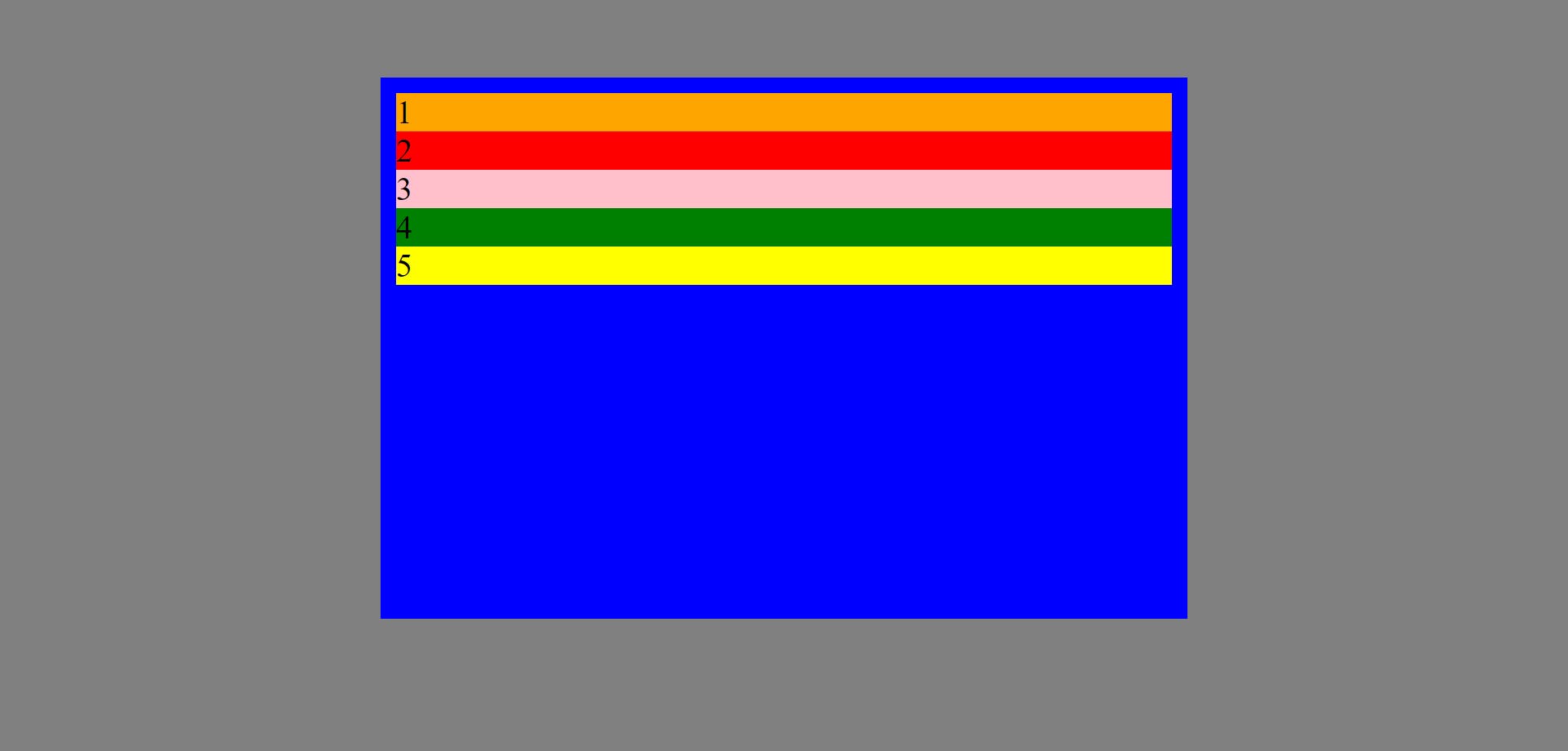
The element whose position is absolute is removed from the normal/default flow of the document and no space/gap is maintained for the element on the page layout. Syntax - position: absolute;
For example:
HTML code:
    <div class="container">
        <div class="one">1</div>
        <div class="two">2</div>
        <div class="three">3</div>
        <div class="four">4</div>
        <div class="five">5</div>
    </div>
CSS code:
body{
    background-color: grey;
}

.container{
    background-color: blue;
    padding: 5%;
    width: 50%;
    margin: 10% auto;
}

.container .one{
    background-color: orange;
    font-size: xx-large;
    text-align: center;
}

.container .two{
    background-color: red;
    font-size: xx-large;
    text-align: center;
}

.container .three{
    background-color: pink;
    font-size: xx-large;
    position: absolute;
    text-align: center;
}

.container .four{
    background-color: green;
    font-size: xx-large;
    text-align: center;
}

.container .five{
    background-color: yellow;
    font-size: xx-large;
    text-align: center;
}
Output:
We can see element class three is removed from the normal document flow and is overlapping element class four and no space/gap is maintained between element class two and class four (unlike space/gap was maintained in relative position). Also, its width is automatically reduced as soon as we give absolute position to element class three, this happens with absolute position.
Top, right, bottom and left properties are applicable to absolute position.
The element with absolute position is positioned with respect to its nearest ancestor/parent if its nearest ancestor/parent is given relative position. For example:
HTML code:
    <div class="container">
        <div class="one">1</div>
        <div class="two">2</div>
        <div class="three">3</div>
        <div class="four">4</div>
        <div class="five">5</div>
    </div>
CSS code:
body{
    background-color: grey;
    padding: 5%;
}

.container{
    background-color: blue;
    padding: 5%;
    position: relative;
    width: 50%;
    margin: 4% auto;
}

.container .one{
    background-color: orange;
    font-size: xx-large;
    text-align: center;
}

.container .two{
    background-color: red;
    font-size: xx-large;
    text-align: center;
}

.container .three{
    background-color: pink;
    font-size: xx-large;
    position: absolute;
    top: 20px;
    left: 30px;
    text-align: center;
}

.container .four{
    background-color: green;
    font-size: xx-large;
    text-align: center;
}

.container .five{
    background-color: yellow;
    font-size: xx-large;
    text-align: center;
}
Output:
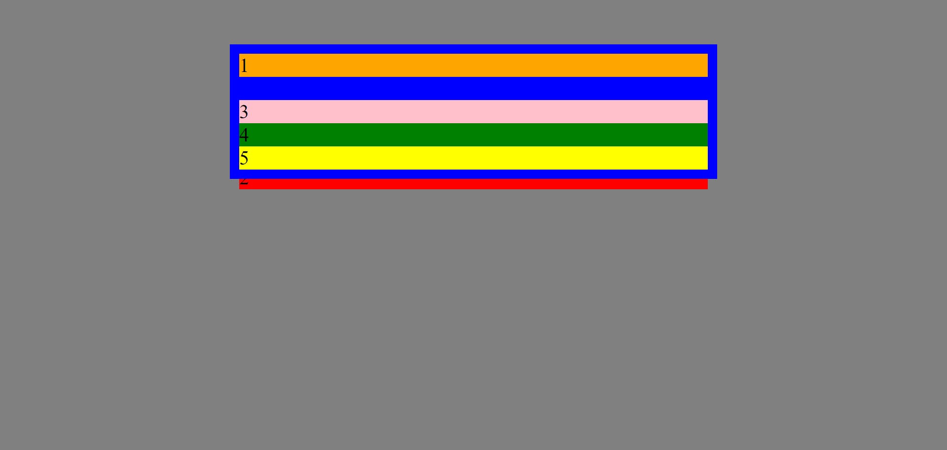
Since the element class container (blue container) is given relative position, so the absolutely positioned element class three is positioned relative to its nearest ancestor/parent i.e. class container, which means element class three will take class container as a reference while taking top, right, bottom and left offset. So, element class three is at an offset of 20px from the top of the class container and at an offset of 30px from the left of the class container.
But when the nearest ancestor/parent (i.e. class container) of the absolutely positioned element (i.e. class three) is not given relative position, then the absolutely positioned element i.e. class three will take browser as reference. For example:
HTML code:
    <div class="container">
        <div class="one">1</div>
        <div class="two">2</div>
        <div class="three">3</div>
        <div class="four">4</div>
        <div class="five">5</div>
    </div>
CSS code:
body{
    background-color: grey;
}

.container{
    background-color: blue;
    padding: 5%;
    width: 50%;
    margin: 10% auto;
}

.container .one{
    background-color: orange;
    font-size: xx-large;
    text-align: center;
}

.container .two{
    background-color: red;
    font-size: xx-large;
    text-align: center;
}

.container .three{
    background-color: pink;
    font-size: xx-large;
    position: absolute;
    top: 100px;
    left: 50px;
    text-align: center;
}

.container .four{
    background-color: green;
    font-size: xx-large;
    text-align: center;
}

.container .five{
    background-color: yellow;
    font-size: xx-large;
    text-align: center;
}
Output:
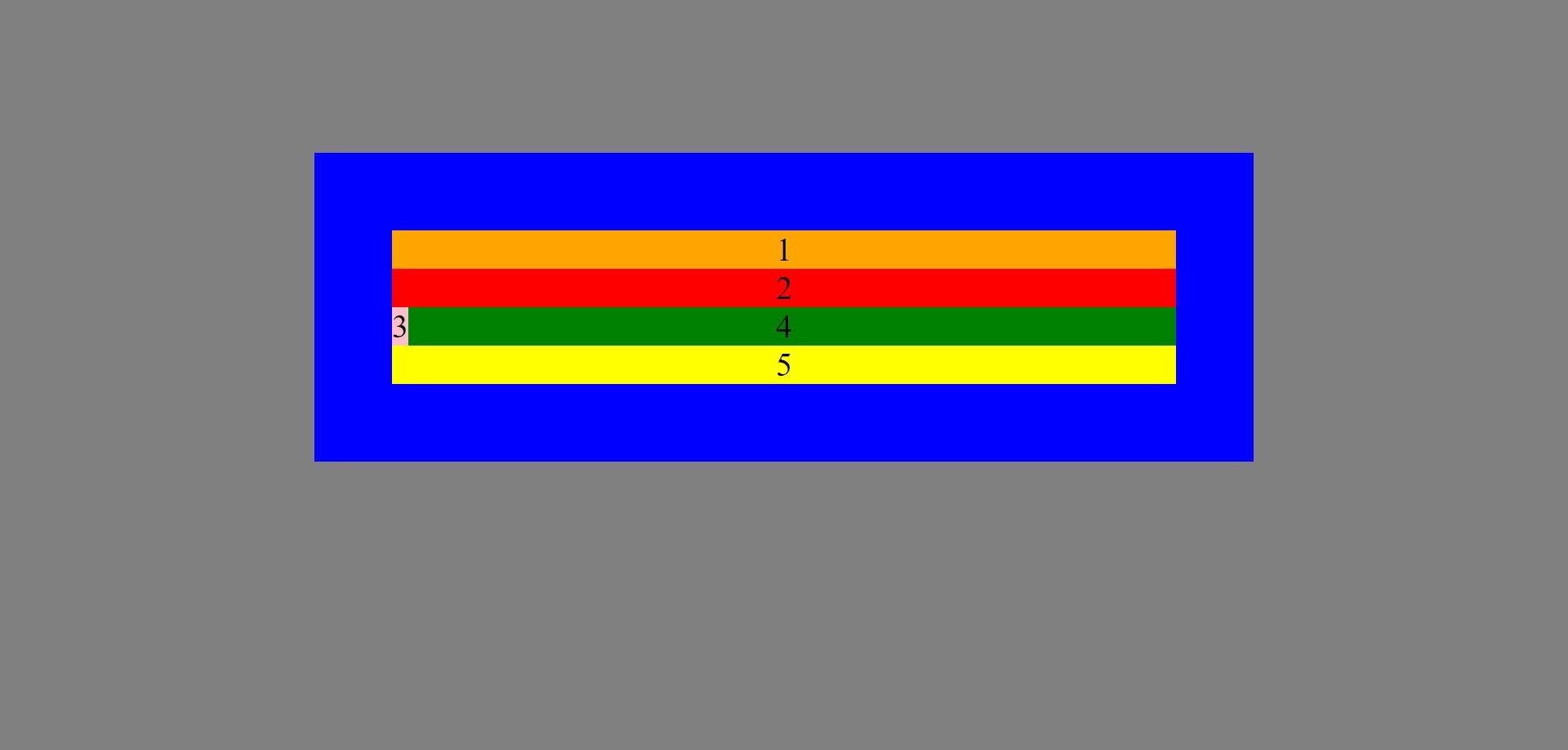
Since, class container is not given relative position, therefore, the absolutely positioned element class three will take browser (grey background) as reference. Hence, class three is at an offset of 50px from the left of browser and at an offset of 100px from the top of browser.
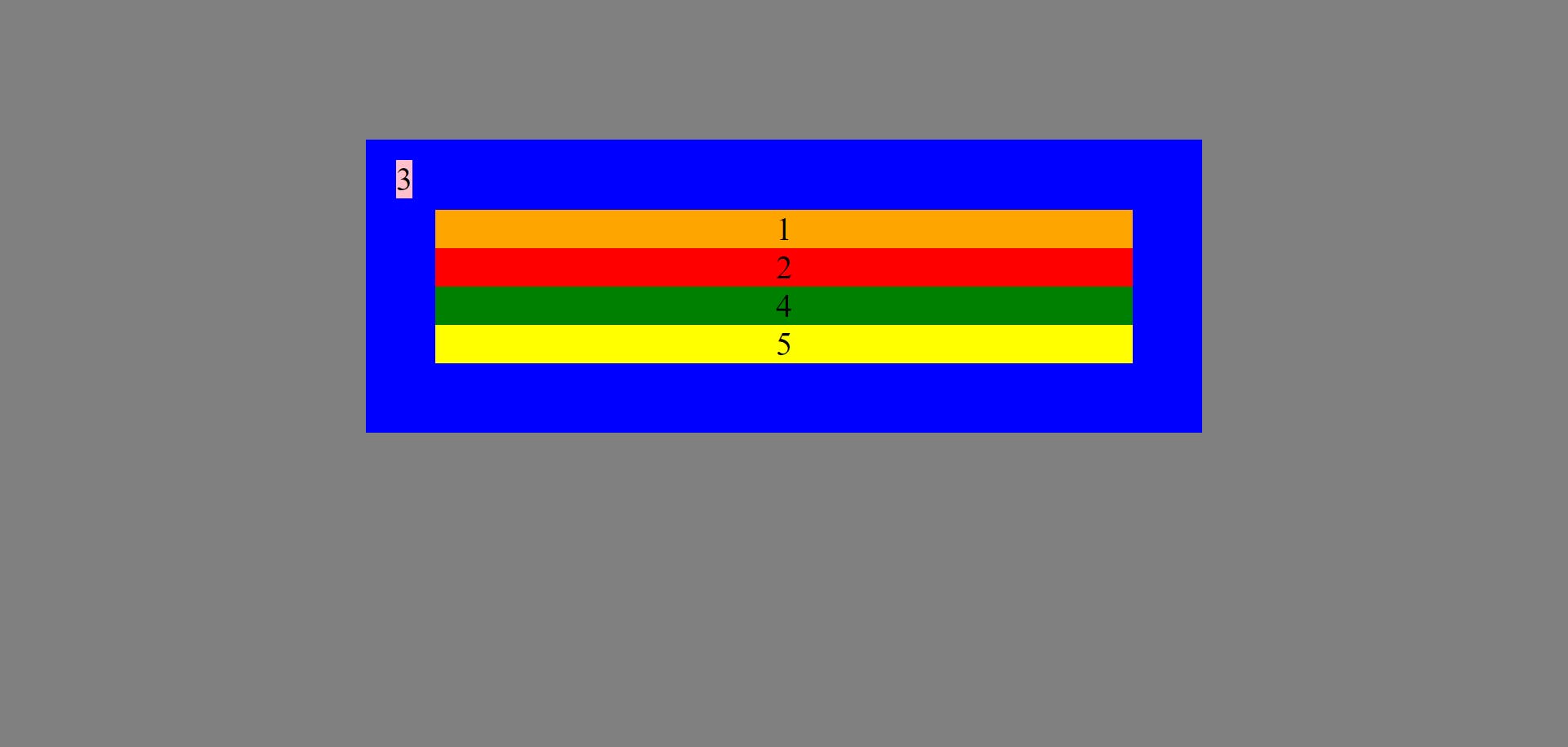
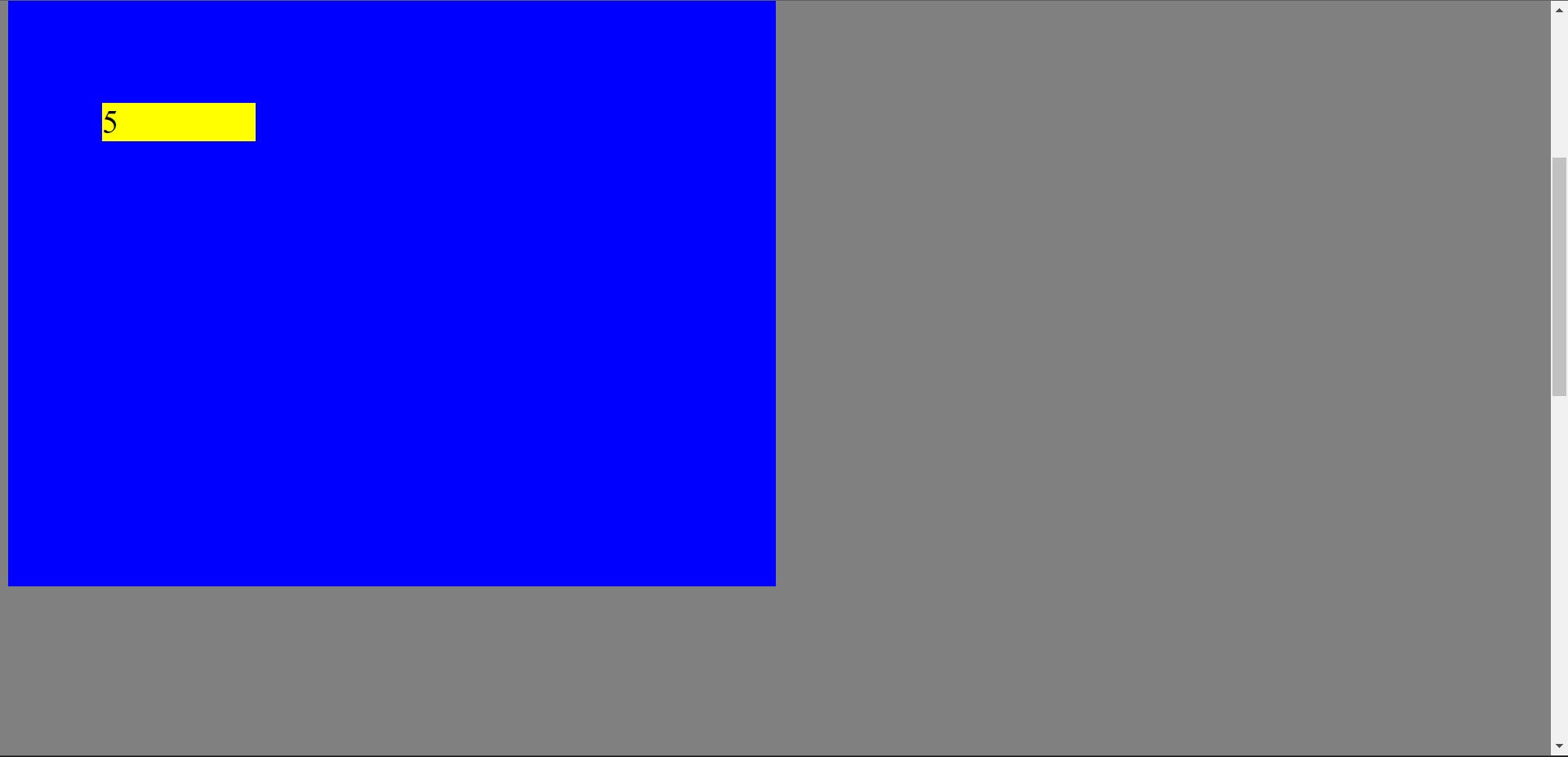
z-index is applicable to an absolutely positioned element. For example:
HTML code:
    <div class="container">
        <div class="one">1</div>
        <div class="two">2</div>
        <div class="three">3</div>
        <div class="four">4</div>
        <div class="five">5</div>
    </div>
CSS code;
body{
    background-color: grey;
}

.container{
    background-color: blue;
    padding: 5%;
    position: relative;
    width: 50vw;
    margin: 5% auto;
    z-index: -2;
}

.container .one{
    background-color: orange;
    text-align: center;
    font-size: xx-large;
}

.container .two{
    background-color: red;
    text-align: center;
    font-size: xx-large;
}

.container .three{
    background-color: pink;
    position: absolute;
    left: 69px;
    text-align: center;
    font-size: xx-large;
    z-index: -1;
}

.container .four{
    background-color: green;
    text-align: center;
    font-size: xx-large;
}

.container .five{
    background-color: yellow;
    text-align: center;
    font-size: xx-large;
}
Output:

Since by default, the z-index of class one, two, four, five is zero and that of class three and class container is -1 and -2 respectively so class three is below class one, two, four, five and above class container.
We can also give z-index to an element whose position is absolute without giving top, right, bottom and left offset.
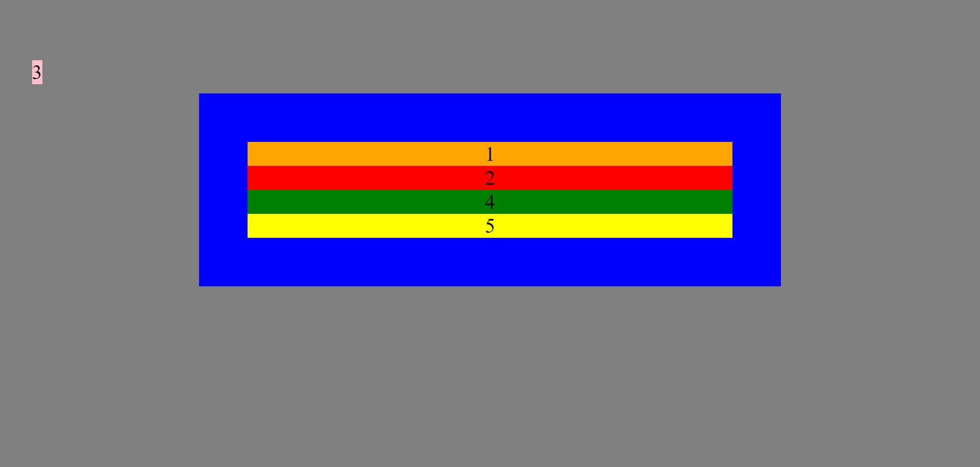
4. Fixed position
The element with fixed position is removed from the normal document flow and no space is created for the element in the page layout i.e. the space for the element is not maintained as if the position were static.
Syntax - position: fixed;
For example:
HTML code:
    <div class="container">
        <div class="one">1</div>
        <div class="two">2</div>
        <div class="three">3</div>
        <div class="four">4</div>
        <div class="five">5</div>
    </div>
CSS code:
body{
    background-color: grey;
    padding: 5%;
    height: 200vh;
}

.container{
    background-color: blue;
    padding: 5%;
    width: 50%;
    margin: 0 auto;
}

.container .one{
    background-color: orange;
    font-size: xx-large;
    text-align: center;
}

.container .two{
    background-color: red;
    font-size: xx-large;
    text-align: center;
}

.container .three{
    background-color: pink;
    font-size: xx-large;
    text-align: center;
}

.container .four{
    background-color: green;
    font-size: xx-large;
    text-align: center;
    position: fixed;
}

.container .five{
    background-color: yellow;
    font-size: xx-large;
    text-align: center;
}
Output:
Element class four is removed from normal document flow and the space between class three and class five is not maintained (unlike it was maintained in relative position).
The width of the element class four is also reduced as soon as it is given fixed position, this happens with fixed-positioned element.
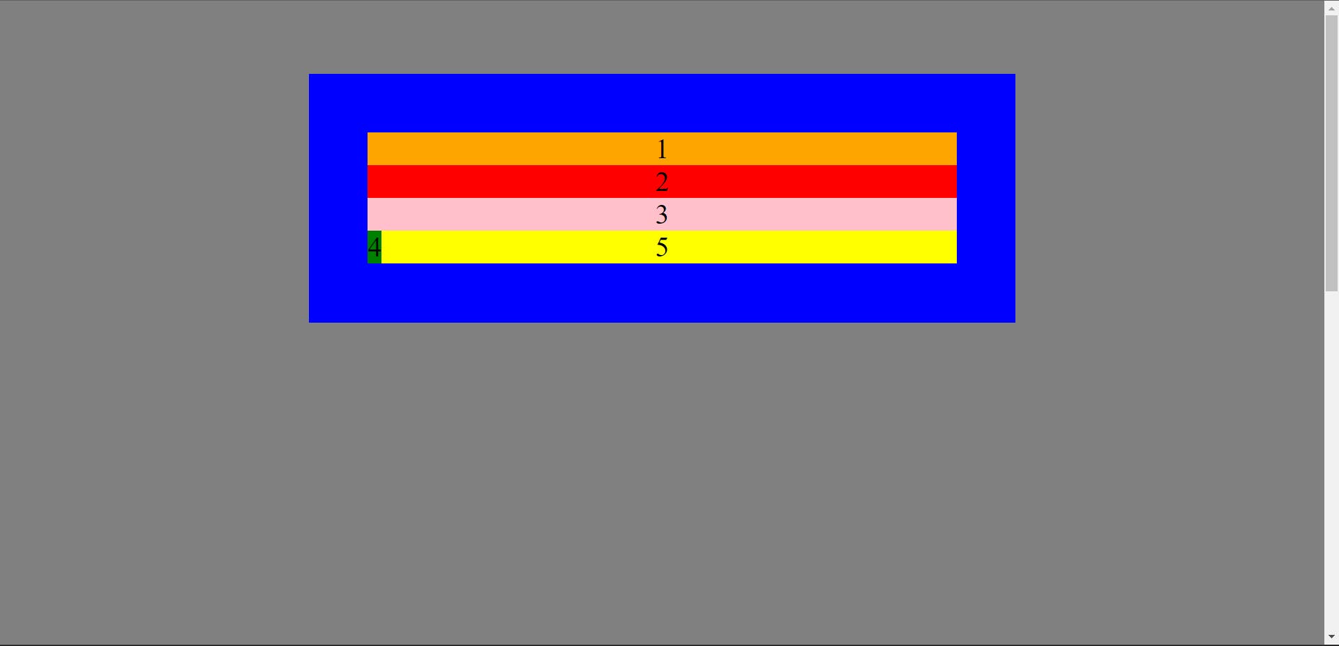
Top, right, bottom and left properties are applicable to a fixed-positioned element. The fixed-positioned element will take viewport as reference or is positioned with respect to the viewport. For example:
HTML code:
    <div class="container">
        <div class="one">1</div>
        <div class="two">2</div>
        <div class="three">3</div>
        <div class="four">4</div>
        <div class="five">5</div>
    </div>
CSS code:
body{
    background-color: grey;
    padding: 5%;
    height: 200vh;
}

.container{
    background-color: blue;
    padding: 5%;
    width: 50%;
    margin: 0 auto;
}

.container .one{
    background-color: orange;
    font-size: xx-large;
    text-align: center;
}

.container .two{
    background-color: red;
    font-size: xx-large;
    text-align: center;
}

.container .three{
    background-color: pink;
    font-size: xx-large;
    text-align: center;
}

.container .four{
    background-color: green;
    font-size: xx-large;
    text-align: center;
    position: fixed;
    top: 50px;
    left: 200px;
}

.container .five{
    background-color: yellow;
    font-size: xx-large;
    text-align: center;
}
Output:

The fixed-positioned element class four is taking viewport (grey background) as reference and is at an offset of 50px from the top of viewport and at an offset of 200px from the left of viewport.
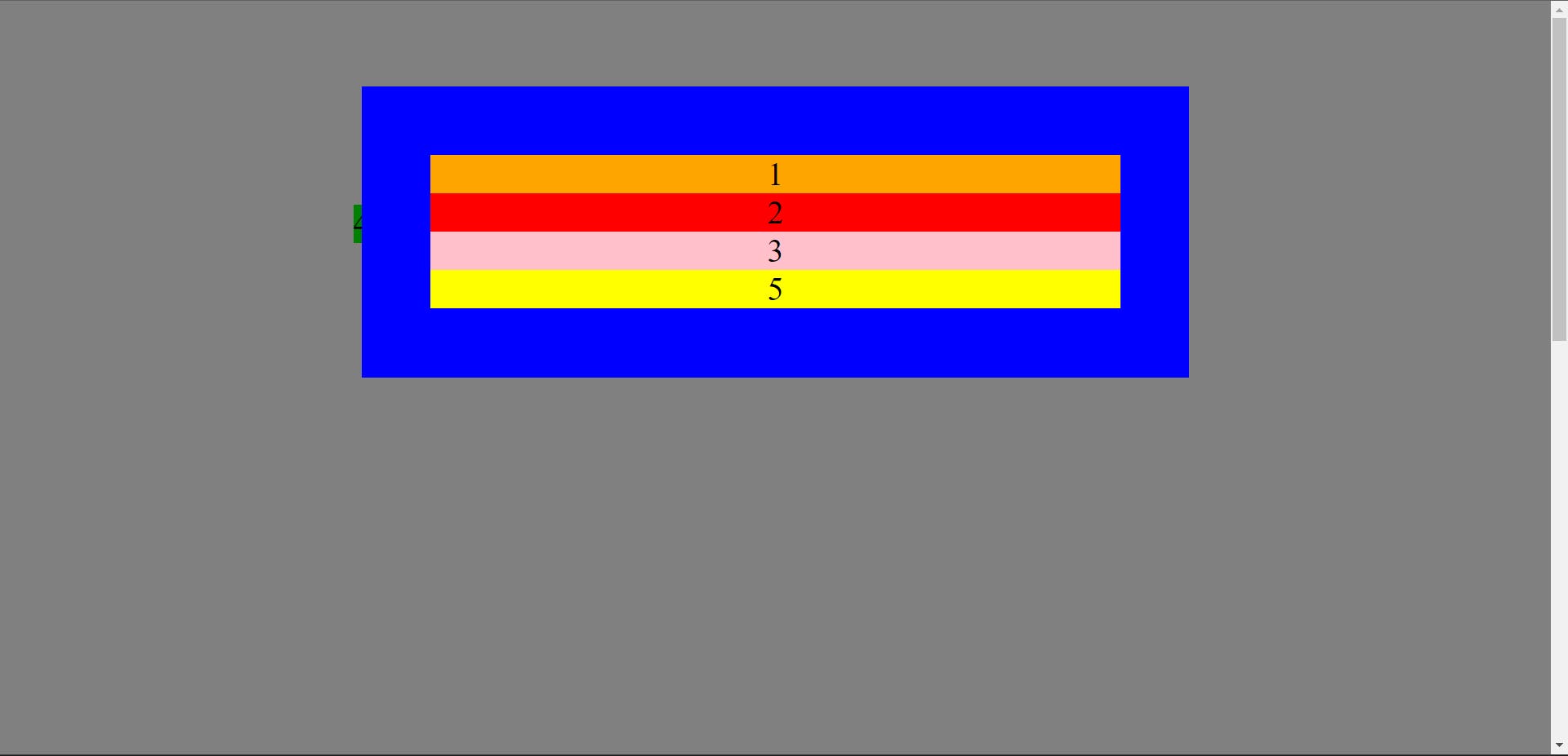
The fixed-positioned element will remain fixed at its position and has no scrolling effect i.e. while scrolling whether it is given top, right, bottom and left offset or not it has no scrolling effect.
For example, in the above example, if we scroll down the scroll bar then element class four will remain fixed at its position i.e. 50px from the top and 200px from the left of the viewport but all the other elements on the web page (class container, one, two, three and five) will move along the scroll bar while scrolling up and down as shown in the output below:
Output:

Look at the scroll bar position, it has scrolled down, and all the elements except fixed positioned element (class four) have moved up as the scroll bar has moved down but the fixed-positioned element (class four) will remain fixed throughout scrolling i.e. it has no scrolling effect and will remain fixed at an offset of 50px from the top and at an offset of 200px from the left of viewport throughout scrolling.
Similarly, when the element class four is assigned fixed position and top, right, bottom, and left offsets are not given, then also on scrolling the element class four will remain fixed with respect to the viewport and all the other elements on the webpage (class container, one, two, three and five) will move along with scrolling.
For example:
HTML code:
    <div class="container">
        <div class="one">1</div>
        <div class="two">2</div>
        <div class="three">3</div>
        <div class="four">4</div>
        <div class="five">5</div>
    </div>
CSS code:
body{
    background-color: grey;
    padding: 5%;
    height: 200vh;
}

.container{
    background-color: blue;
    padding: 5%;
    width: 50%;
    margin: 0 auto;
}

.container .one{
    background-color: orange;
    font-size: xx-large;
    text-align: center;
}

.container .two{
    background-color: red;
    font-size: xx-large;
    text-align: center;
}

.container .three{
    background-color: pink;
    font-size: xx-large;
    text-align: center;
}

.container .four{
    background-color: green;
    font-size: xx-large;
    text-align: center;
    position: fixed;
}

.container .five{
    background-color: yellow;
    font-size: xx-large;
    text-align: center;
}
Output:

z-index property is applicable to a fixed-positioned element. For example:
HTML code:
    <div class="container">
        <div class="one">1</div>
        <div class="two">2</div>
        <div class="three">3</div>
        <div class="four">4</div>
        <div class="five">5</div>
    </div>
CSS code:
body{
    background-color: grey;
    padding: 5%;
    height: 200vh;
}

.container{
    background-color: blue;
    padding: 5%;
    width: 50%;
    margin: 0 auto;
}

.container .one{
    background-color: orange;
    font-size: xx-large;
    text-align: center;
}

.container .two{
    background-color: red;
    font-size: xx-large;
    text-align: center;
}

.container .three{
    background-color: pink;
    font-size: xx-large;
    text-align: center;
}

.container .four{
    background-color: green;
    font-size: xx-large;
    text-align: center;
    position: fixed;
    top: 200px;
    left: 346px;
    z-index: -1;
}

.container .five{
    background-color: yellow;
    font-size: xx-large;
    text-align: center;
}
Output:
The z-index of element class container, one, two, three and five is zero (by default) and the z-index of fixed-positioned element class four is -1 so element class four is below element class container.
z-index can also be given to a fixed-positioned element without giving top, right, bottom and left offset.
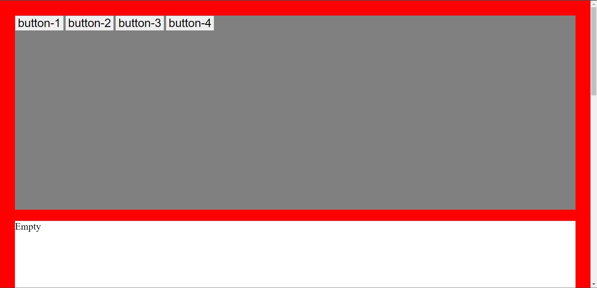
5. Sticky position
In sticky position, the element is positioned according to the normal flow of the document. For example:
HTML code:
    <div class="container-1">
        <button>button-1</button>
        <button>button-2</button>
        <button>button-3</button>
        <button>button-4</button>
    </div>
    <div class="container-2">
        Empty
    </div>
CSS code:
body{
    background-color: red;
    height: 300vh;
    padding: 2%;
}

.container-1{
    background-color: grey;
    height: 500px;
}

button{
    font-size: 30px;
}

button:nth-child(2){
    position: sticky;
}

.container-2{
    font-size: 25px;
    background-color: #fff;
    margin-top: 2%;
    height: 500px;
}
Output:
Top, right, bottom and left properties are applicable to a sticky-positioned element.
The sticky-positioned element will take its nearest parent container as reference and will take top, right, bottom and left offsets within its nearest parent container.
The sticky-positioned element will scroll along with its nearest parent container until it is at the top of its nearest parent container or given offset from its nearest parent container is achieved and then it sticks (like fixed position) and stops further scrolling. In simple words, the sticky-positioned element will behave like relative until a given offset within its nearest parent container is achieved and then it sticks (like fixed position). Hence, sticky position is a combination of relative and fixed position. For example:
HTML code:
    <div class="container-1">
        <button>button-1</button>
        <button>button-2</button>
        <button>button-3</button>
        <button>button-4</button>
    </div>
    <div class="container-2">
        Empty
    </div>
CSS code:
body{
    background-color: red;
    height: 300vh;
    padding: 2%;
}

.container-1{
    background-color: grey;
    height: 500px;
}

button{
    font-size: 30px;
}

button:nth-child(2){
    position: sticky;
    top: 35px;
}

.container-2{
    font-size: 25px;
    background-color: #fff;
    margin-top: 2%;
    height: 500px;
}
Output:
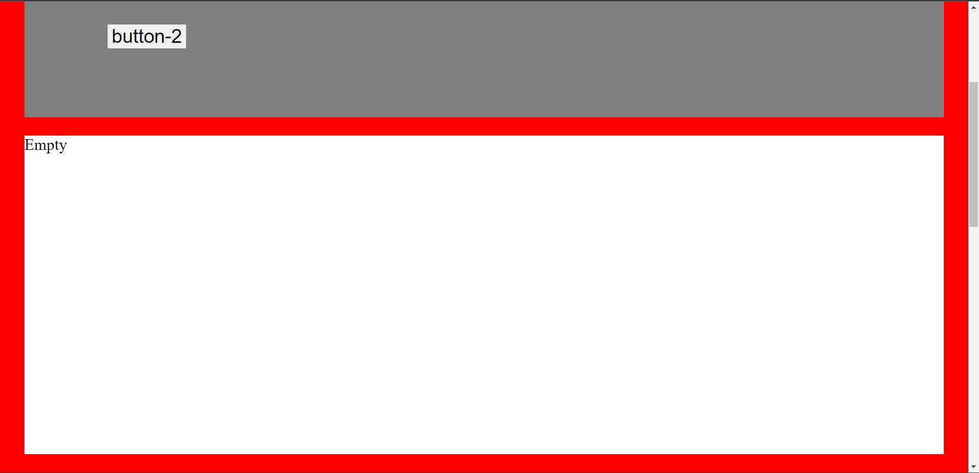
On scrolling, the sticky-positioned element button-2 has moved 35px from the top of its nearest parent container or from its initial position (like relative position) and sticks and stopped further scrolling (like fixed position).
The sticky-positioned element will not take offset (top, right, bottom and left) beyond the dimensions (height and width) of its nearest parent container. If an offset beyond the dimensions of its nearest parent container is given to a sticky-positioned element then it will stick to the vertical or horizontal boundaries of its nearest parent container depending upon the offset given i.e. vertical offset (top/bottom) and horizontal offset (right/left). For example:
HTML code:
    <div class="container-1">
        <button>button-1</button>
        <button>button-2</button>
        <button>button-3</button>
        <button>button-4</button>
    </div>
    <div class="container-2">
        Empty
    </div>
CSS code:
body{
    background-color: red;
    height: 300vh;
    padding: 2%;
}

.container-1{
    background-color: grey;
    height: 500px;
}

button{
    font-size: 30px;
}

button:nth-child(2){
    position: sticky;
    top: 600px;
}

.container-2{
    font-size: 25px;
    background-color: #fff;
    margin-top: 2%;
    height: 500px;
}
Output:
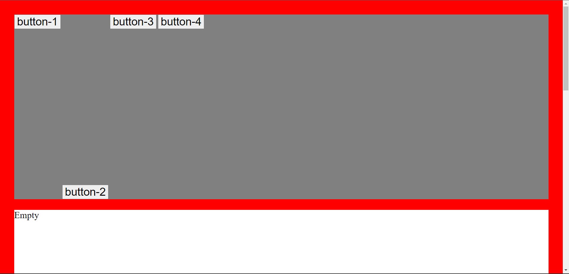
The sticky-positioned element button-2 has a top offset of 600px which is more than the height (500px) of its nearest parent container (element class container-1) so it sticks to the bottom of the class container-1 and on scrolling also it will stick to the bottom of class container-1, because sticky element takes its nearest parent container as reference and will remain within its parent container in all the cases i.e. with or without top, right, bottom and left offsets or even when the given offsets are beyond the dimensions of its nearest parent container.
Right/left offset is applicable to a block-level element (button is an inline element).
For example:
HTML code:
    <div class="container">
        <div class="one">1</div>
        <div class="two">2</div>
        <div class="three">3</div>
        <div class="four">4</div>
        <div class="five">5</div>
    </div>
CSS code:
body{
    background-color: grey;
    height: 300vh;
}

.container{
    background-color: blue;
    width: 50%;
    height: 1000px;
}

.container .one{
    background-color: orange;
    font-size: xx-large;
}

.container .two{
    background-color: red;
    font-size: xx-large;
}

.container .three{
    background-color: pink;
    font-size: xx-large;
}

.container .four{
    background-color: green;
    font-size: xx-large;
}

.container .five{
    background-color: yellow;
    font-size: xx-large;
    position: sticky;
    width: 20%;
    top: 100px;
    left: 100px;
}
Output:
Sticky-positioned element class five is taking left offset of 100px because it is block-level element. On scrolling it will take top offset of 100px also as shown in the output below:
Output:
Element class five is given 20% width so that it can take left offset otherwise with 100% width it will have no space within its nearest parent container to take left offset. If we will give margin auto to its parent container (blue container) then also class five will not take left offset.
Fixed vs sticky position
The major difference between fixed and sticky position is that the fixed-positioned element is removed from the normal flow of the document and take viewport as reference while in sticky-position, the normal flow of the document is maintained and the sticky-positioned element will take its nearest parent container as reference.
For example:
HTML code:
    <div class="box-1">
        <button>Facebook</button>
        <button>Gmail</button>
    </div>

    <div class="box-2"></div>
CSS code:
body{
    background-color: #ffc0cb;
    height: 400vh;
}

.box-1{
    background-color: #808080;
    height: 500px;
}

button:nth-child(1){
    position: fixed;
    top: 80px;
    left: 90px;
    font-size: 20px;
}

button:nth-child(2){
    position: sticky;
    top: 50px;
    left: 200px;
    font-size: 20px;
}

.box-2{
    margin-top: 100px;
    margin-top: 1%;
    background-color: aqua;
    height: 500px;
}
Output:
On scrolling, the sticky-positioned element (Gmail button) will take offset within its nearest parent container and will remain within its nearest parent container, but the fixed-positioned element (Facebook button) will become fixed at its offset and will have no scrolling effect as shown in the output below:
Output:
